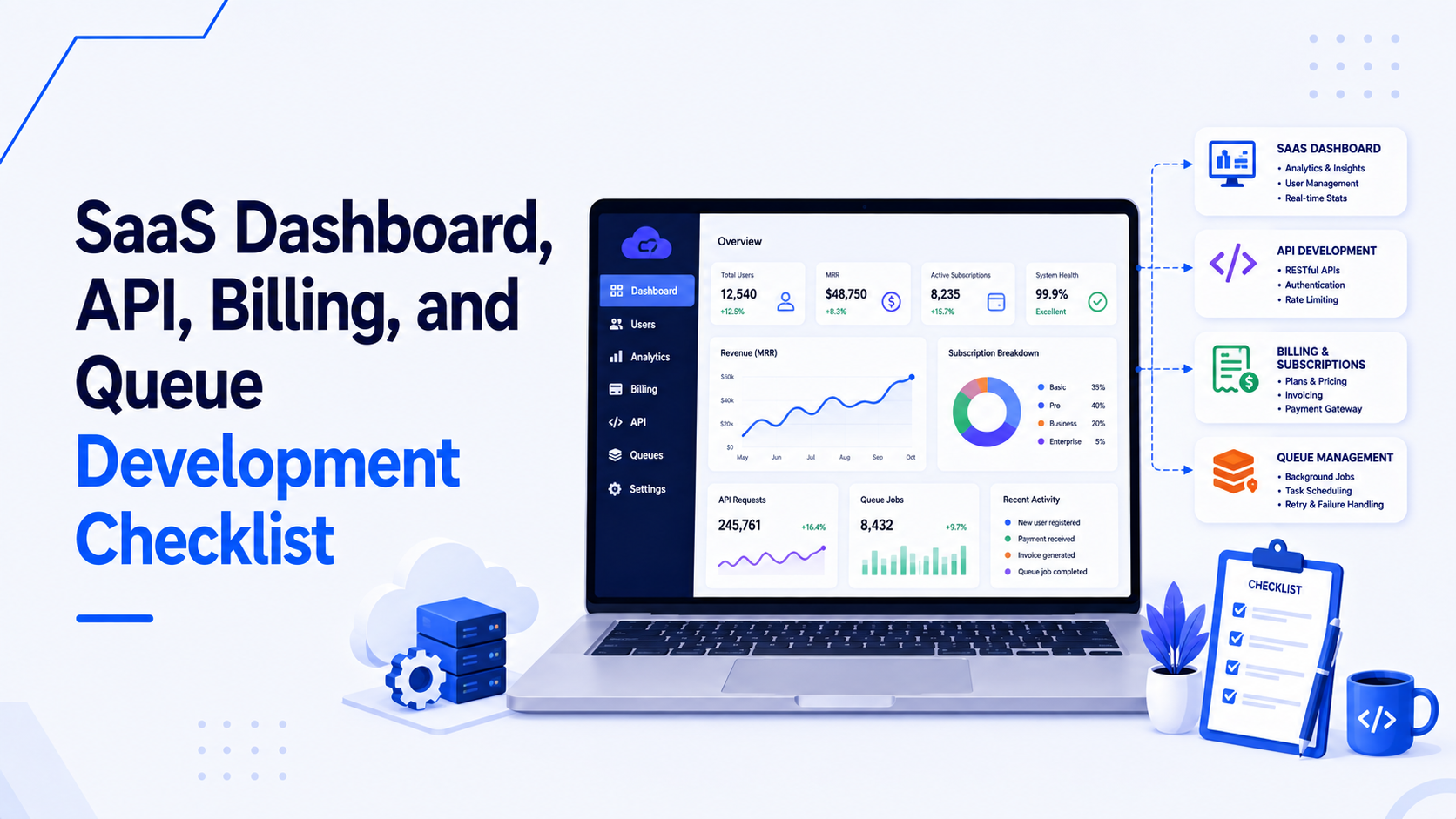
Analytics dashboards are distinct from operational dashboards. An operational dashboard (like a list of users or a configuration panel) focuses on precise, row-level data manipulation. An analytics dashboard focuses on aggregation, trends, and time-series comparisons. Building an analytics dashboard in React requires a different architectural approach, particularly in how data is requested from the backend and how state is managed across multiple visual widgets.
This article explores the best practices for bridging a React frontend with an API backend to deliver fast, interactive analytics experiences.
1. The API Boundary: Aggregate on the Server
The most common mistake in building analytics dashboards is fetching raw data and calculating metrics on the client. If your React app downloads 10,000 raw sales records to calculate the "Total Revenue" sum, you have failed the architecture. The payload is massive, the parsing is slow, and the UI will freeze.
The Golden Rule: The API must return pre-aggregated data formatted exactly for the charting library. The backend (whether Node.js, Laravel, or Python) should execute the GROUP BY, SUM(), and COUNT() operations in the database, and return a lightweight JSON array.
Instead of receiving this: [{ id: 1, amount: 50, date: '2026-07-01' }, { id: 2, amount: 20, date: '2026-07-01' }, ...]
React should receive this: [{ date: '2026-07-01', total: 70 }, ...]
This keeps the React frontend thin, fast, and entirely focused on presentation.
2. Managing Global Filter State
An analytics dashboard typically features a global control panel at the top (e.g., Date Range, Region, Customer Segment). When these global filters change, every chart and KPI card on the page must update.
- URL Query Parameters as Truth: Do not store the global date range solely in React state (
useState). Store it in the URL (?start=2026-06-01&end=2026-06-30®ion=EU). This ensures that users can bookmark the exact dashboard view, share it on Slack, or refresh the page without losing their context. - Context API or Zustand: Extract the URL parameters and place them into a lightweight global store (Zustand) or Context. Every chart component subscribes to this state and automatically triggers a new API request when the parameters change.
3. Concurrent Data Fetching
A typical analytics page might have six distinct widgets: Total Revenue (KPI), Active Users (KPI), Revenue by Month (Bar Chart), Users by Country (Map), Top Products (Table), and Churn Rate (Line Chart). Fetching these sequentially will result in a slow, staggered loading experience.
- Independent Queries: Use TanStack Query (React Query). Build individual components for each widget, and let each component execute its own
useQueryhook concurrently. - Skeleton Loaders: Because the widgets load independently, they will resolve at different times. Use skeleton loaders (gray, pulsating shapes matching the dimensions of the chart) rather than generic spinning circles. This prevents layout shift and makes the application feel significantly faster.
- BFF (Backend for Frontend) Optimization: If six concurrent HTTP requests are causing overhead, create a specific BFF endpoint (e.g.,
/api/dashboard-summary) that executes the six database queries in parallel on the server and returns a single, combined JSON payload to React.
4. Charting Libraries: Flexibility vs. Complexity
The choice of charting library dictates the development speed and final capability of the dashboard.
- Recharts: The safest default for React. It uses a composable, declarative syntax (
<LineChart><Line /><XAxis /></LineChart>). It is highly customizable, handles responsive resizing well, and relies on SVG. Best for standard business metrics. - Chart.js (via react-chartjs-2): Excellent out-of-the-box aesthetics and animations. It renders to Canvas, which makes it more performant for medium-sized datasets compared to SVG libraries, though it is slightly less "React-like" in its configuration (using large configuration objects rather than components).
- Nivo: Built on D3 and React. It offers incredibly beautiful, complex visualizations (heatmaps, sunbursts, network graphs) but has a steeper learning curve and larger bundle size.
5. Handling "No Data" and Edge Cases
Analytics dashboards break down when data is sparse. If a user filters by a date range where no activity occurred, the UX must handle it gracefully.
- Zero-Filling: If a user requests data for the last 7 days, and there was only activity on days 1 and 5, the API must return an array with 7 objects, filling days 2, 3, 4, 6, and 7 with zeroes. If the API omits those days, a line chart will draw a direct, misleading line from day 1 to day 5.
- Empty States: If the entire dataset for a widget is empty, do not render a blank chart with only axes. Render a specific "No data available for this period" message to confirm to the user that the system is working, but the result set is genuinely empty.
Building an analytics dashboard that is both accurate and performant requires seamless coordination between the database, the API, and React. If you need an experienced developer to build your data-heavy SaaS features, visit my React and Next.js development services page.

Prakash Tank
Full-Stack Architect & Tech Enthusiast. Passionate about building scalable applications and sharing knowledge with the community.