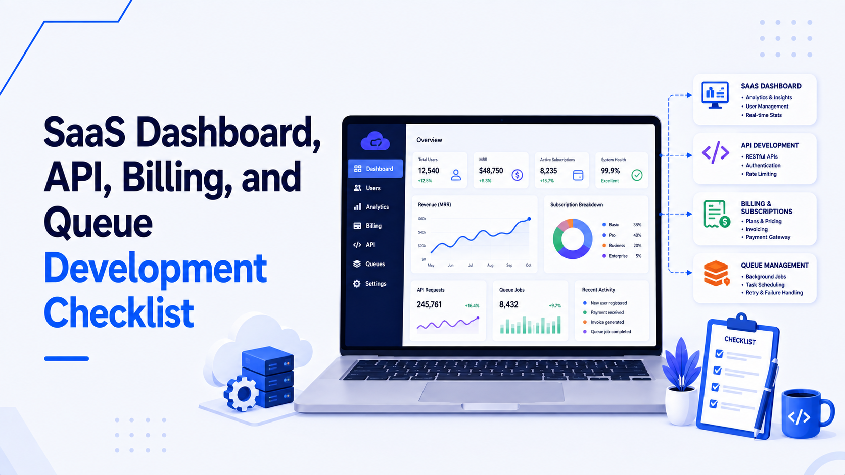
A SaaS dashboard is fundamentally a tool for answering questions and taking action. "How many active subscriptions do we have?" "Which invoices are overdue?" "Cancel this user's account." The user experience (UX) of a dashboard is not measured by how pretty it is, but by how quickly and accurately a user can accomplish these tasks without consulting a manual. In a React application, achieving this requires combining solid UI design with performant component engineering.
This article covers the four pillars of dashboard UX: tables, filters, charts, and role-based views, and how to implement them effectively in React.
1. Data Tables: The Workhorse of the Dashboard
The data table is the most common interface in any B2B SaaS application. A poor table implementation forces users into endless pagination clicks or horizontal scrolling frustration.
- Server-Side Everything: For any dataset that can grow beyond a few hundred records, sorting, filtering, and pagination must be handled by the backend API. The React table component should only request the data it needs for the current view. TanStack Table (formerly React Table) is the industry standard headless utility for managing this complex state.
- Density and Readability: Business users prefer data density over whitespace. A table with excessive padding forces users to scroll unnecessarily. Offer a "density toggle" (Compact, Normal, Comfortable) to let users choose.
- Action Menus: Avoid cluttering every row with five buttons (Edit, Delete, View, Duplicate, Export). Place primary actions directly on the row, and hide secondary actions behind a trailing "three dots" (kebab) dropdown menu.
- Sticky Headers and Columns: When a user scrolls down 50 rows, the column headers must remain visible. If the table has 15 columns, the primary identifier column (e.g., Customer Name) and the action column should be sticky horizontally, allowing the middle data to scroll underneath them.
2. Advanced Filtering and Search
Users need to slice data precisely. A single global search bar is rarely sufficient for a complex dashboard.
- Faceted Filtering: Instead of simple text inputs, use faceted filters (dropdowns with checkboxes) for categorical data (e.g., Status: Active, Pending, Cancelled). Show counts next to the facets if the API supports it.
- The Filter Bar Pattern: Display active filters as removable "pills" or "chips" above the table. This provides immediate visual context of what data is currently being viewed and allows users to clear individual filters with a single click.
- URL State Syncing: This is a critical React UX pattern. When a user applies a filter, sorts a column, or changes a page, update the URL query parameters (e.g.,
?status=active&page=2&sort=date_desc). This ensures that if the user refreshes the page or shares the link with a colleague, the exact dashboard state is preserved. React Router makes this straightforward.
3. Charts and Data Visualization
Charts must communicate trends instantly. Misusing chart types or overloading them with data causes cognitive overload.
- Library Selection: Recharts is the standard for React—it uses declarative components and SVG, making it easy to style and animate. For extreme data density (tens of thousands of points), use ECharts (canvas-based) for performance.
- Choose the Right Chart:
- Line charts: Time-series data (e.g., MRR over 12 months).
- Bar charts: Comparing discrete categories (e.g., Sales by Region).
- Pie/Donut charts: Only use when showing parts of a whole with fewer than 5 categories. Never use them for time series.
- Tooltips and Context: A chart without context is just a picture. Hover tooltips must provide exact numbers and dates. Always include a clear title, axis labels, and a legend.
- Empty States: What does the chart look like on day one when there is no data? Do not show a broken graphic or a blank space. Show an empty state illustration with a clear call-to-action (e.g., "Connect your Stripe account to see revenue data").
4. Role-Based Views (RBAC UI)
SaaS products usually have different user tiers: Admins, Managers, and Viewers. The UI must adapt to these roles cleanly.
- Conditional Rendering, Not Disabled Buttons: If a user does not have permission to delete a project, do not render a disabled "Delete" button. Remove the button from the DOM entirely. Disabled buttons cause frustration because users waste time trying to figure out how to enable them.
- The `Can` Component Pattern: Create a wrapper component that checks the current user's permissions.
This abstracts the permission logic out of your UI components, keeping the code clean and semantic.<Can I="delete" a="Project"> <Button variant="danger">Delete Project</Button> </Can> - Graceful Degradation of Views: If a dashboard page contains five widgets, and the user only has permission to view three of them, the layout should reflow gracefully rather than leaving gaping holes or showing "Access Denied" error boxes.
The Goal: Invisible Complexity
The best dashboard UX makes complex tasks feel simple. Achieving this requires rigorous attention to state management, component composition, and routing in React. If you need a partner to design and build an intuitive, high-performance SaaS dashboard, visit my React and Next.js development services page.

Prakash Tank
Full-Stack Architect & Tech Enthusiast. Passionate about building scalable applications and sharing knowledge with the community.